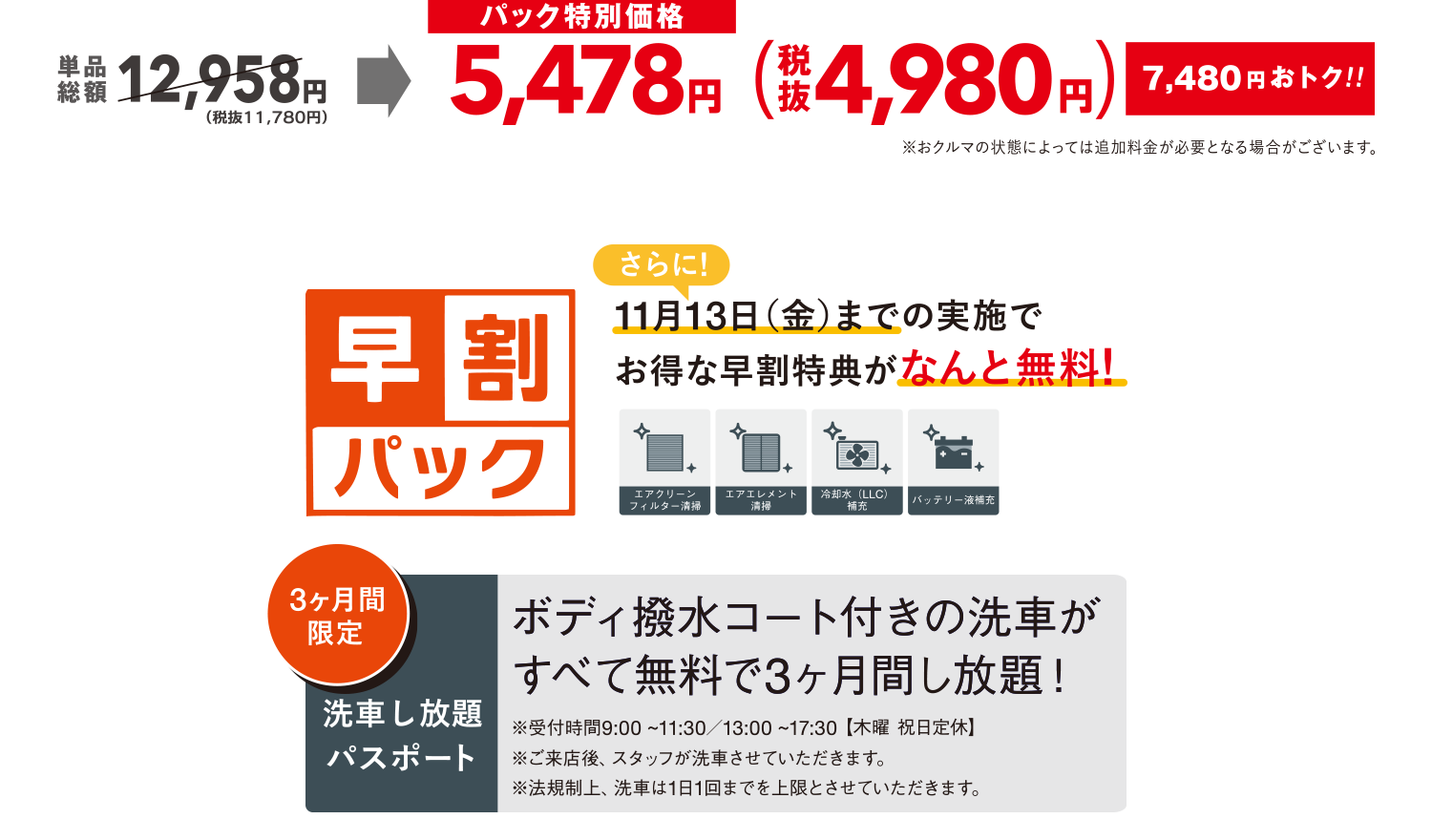
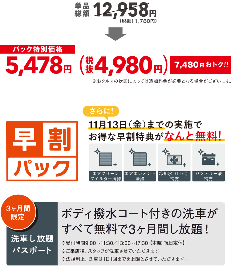
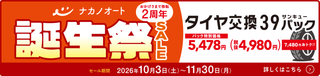
ナカノオートでは大切な皆様に「もしも」がないよう、早めのタイヤ交換をオススメしています。降雪前にタイヤ交換を実施いただいたお客様には、以下の特典をおつけしています。 11個の特別特典がすべてコミコミ! タイヤ交換 タイヤローテーション 安全点検(10項目) シャンプー洗車 ポリマーボディコート ガラス撥水コート ミラー撥水コート タイヤコート タイヤエア調整 ウォッシャー液補充 豪華景品ガチャ タイヤ交換受付中 カレンダーから予約 次回以降の予約がスムーズに! LINE連携してタイヤ交換を予約 ? LINE連携とは? タイヤ交換に関するお問い合わせ 0120-924-970 受付 9:00〜18:30(木・祝定休) ご準備はお済みですか? ①車両ナンバーは車検証のとおりご記入ください。②お名前は姓と名の間にスペースを入れてください。 (例)長岡580 あ 1111中野 太郎 ご予約へ進む タイヤ交換に関するお問い合わせ 0120-31-1439 受付 9:00〜18:30(木・祝定休) .maintenance-price_benefit { margin: 60px 0 30px; text-align: center; } @media only screen and (max-width: 768px) { .maintenance-price_benefit { margin-top: 40px; } } .maintenance-price_legal_title { display: block; width: -moz-fit-content; width: fit-content; align-content: center; min-height: 54px; font-weight: bold; font-size: 24px; letter-spacing: 0.08em; line-height: 1.6; text-align: center; color: #37BBB6; margin-inline: auto; position: relative; } @media only screen and (max-width: 768px) { .maintenance-price_legal_title { font-size: 20px; letter-spacing: 0.05em; } } .maintenance-price_legal_title::before { content: ""; display: block; width: 50px; height: 10px; background-color: #FFF; position: absolute; top: 26px; left: -40px; margin: auto; transform-origin: center; rotate: 75deg; } @media only screen and (max-width: 768px) { .maintenance-price_legal_title::before { width: 40px; left: -28px; } } .maintenance-price_legal_title::after { content: ""; display: block; width: 50px; height: 10px; background-color: #FFF; position: absolute; top: 26px; right: -40px; margin: auto; transform-origin: center; rotate: 105deg; } @media only screen and (max-width: 768px) { .maintenance-price_legal_title::after { width: 40px; right: -28px; } } .maintenance-price_legal_title .big { font-size: 34px; } @media only screen and (max-width: 768px) { .maintenance-price_legal_title .big { font-size: 30px; } } .maintenance-price_legal_title.--green::before, .maintenance-price_legal_title.--green::after { background-color: rgba(55, 187, 182, 0.062745098); } .maintenance-price_legal_items { display: flex; flex-wrap: wrap; gap: 30px 20px; margin-top: 40px; } @media only screen and (max-width: 768px) { .maintenance-price_legal_items { gap: 20px 5px; margin-top: 20px; } } .maintenance-price_legal_item { width: calc(25% - 15px); } @media only screen and (max-width: 768px) { .maintenance-price_legal_item { width: calc(25% - 3.75px); } } .maintenance-price_legal_item.--big { width: calc(33.3333333333% - 13.3333333333px); } @media only screen and (max-width: 768px) { .maintenance-price_legal_item.--big { width: calc(33.3333333333% - 3.3333333333px); } } .maintenance-price_legal_item_btn { display: flex; align-items: center; gap: 15px; transition: 0.3s ease-out; } @media (any-hover: hover) { .maintenance-price_legal_item_btn:hover { opacity: 0.7; } } @media only screen and (max-width: 768px) { .maintenance-price_legal_item_btn { flex-direction: column; gap: 8px; } } .maintenance-price_legal_item_btn img { align-self: self-start; filter: drop-shadow(0px 0px 2px rgba(0, 0, 0, 0.25)); } @media only screen and (max-width: 768px) { .maintenance-price_legal_item_btn img { width: 100%; } } .maintenance-price_legal_caption { font-weight: 500; font-size: 16px; letter-spacing: 0.03em; line-height: 1.6; } @media only screen and (max-width: 768px) { .maintenance-price_legal_caption { font-size: 13px; text-align: center; } } .maintenance-price_legal_caption.--green { font-weight: 700; color: #37BBB6; } .btn.mv_Service_btn { margin-inline: auto; width: 100%; font-size: 18px; } .btn.mv_Service_btn .btn_icon { right: 27px; } @media only screen and (max-width: 768px) { .btn.mv_Service_btn .btn_icon { right: 17px; } } .modal-rsv { width: min(90vw, 640px); max-width: 640px; height: fit-content; max-height: 90vh; margin: auto; padding: 0; display: flex; flex-direction: column; background-color: #FFF; border-radius: 12px; overflow: hidden; box-sizing: border-box; transition: opacity 0.5s, scale 0.5s; } @media only screen and (max-width: 768px) { .modal-rsv { width: 94vw; max-width: 450px; min-height: 420px; } } .modal-rsv:not([open]) { display: none; } .modal-rsv:not([data-active=true]) { opacity: 0; scale: 0.95; } .modal-rsv::backdrop { backdrop-filter: blur(4px); -webkit-backdrop-filter: blur(4px); transition: opacity 0.5s; background: rgba(0, 0, 0, 0.6); } .modal-rsv:not([data-active=true])::backdrop { opacity: 0; } .modal-rsv .modal-rsv_container { flex: 0 1 auto; min-height: 0; overflow-y: auto; -webkit-overflow-scrolling: touch; padding: 24px; box-sizing: border-box; } @media only screen and (max-width: 768px) { .modal-rsv .modal-rsv_container { padding: 24px 8px; } } .modal-rsv .modal-rsv_container > * { flex-shrink: 0; } .modal-rsv .modal-rsv_note { font-weight: 700; font-size: 24px; letter-spacing: 0.1em; color: #FFF; background-color: #37BBB6; padding: 8px; text-align: center; } @media only screen and (max-width: 768px) { .modal-rsv .modal-rsv_note { font-size: 18px; padding: 10px; } } .modal-rsv .modal-rsv_text { text-align: left; font-weight: 500; font-size: 22px; letter-spacing: 0.04em; margin-top: 20px; } @media only screen and (max-width: 768px) { .modal-rsv .modal-rsv_text { font-size: 18px; } } .modal-rsv .modal-rsv_example { font-weight: 500; font-size: 18px; letter-spacing: 0.04em; margin-top: 10px; text-align: center; } @media only screen and (max-width: 768px) { .modal-rsv .modal-rsv_example { font-size: 16px; } } .modal-rsv .modal-rsv_example + .modal-rsv_text { margin-top: 38px; } @media only screen and (max-width: 768px) { .modal-rsv .modal-rsv_example + .modal-rsv_text { margin-top: 30px; } } .modal-rsv .modal-rsv_btn { height: auto; flex-shrink: 0; margin: 30px auto 0; } @media only screen and (max-width: 768px) { .modal-rsv .modal-rsv_btn { width: 100%; margin: 20px auto 0; } } .modal-rsv .shaken-rsv-reservation__tel-body { border: 4px solid #37bbb6; } .shaken-rsv-line-wrapper { display: flex; flex-direction: column; align-items: stretch; margin-top: 15px; } @media (max-width: 768px) { .shaken-rsv-line-wrapper { margin-top: 10px; } } .shaken-rsv-line-lead { text-align: center; font-size: 18px; font-weight: bold; color: #493830; margin: 5px 0; } @media only screen and (max-width: 768px) { .shaken-rsv-line-lead { font-size: 13px; } } .shaken-rsv-line-lead__em { color: #E77461; } .shaken-rsv-reservation__line-btn { display: flex; align-items: center; justify-content: center; gap: 10px; border-radius: 12px; background: linear-gradient(#00c300 0%, #03b219 85.36%, #079d44 100%); box-shadow: 0px 1px 2px rgba(0, 0, 0, 0.08); font-family: "Zen Kaku Gothic New"; font-weight: bold; font-size: 22px; letter-spacing: 0.05em; line-height: 1.4545454545; text-align: center; color: #fff; padding: 14px; transition: 0.3s; } @media (any-hover: hover) { .shaken-rsv-reservation__line-btn:hover { background: linear-gradient(#00d300 0%, #04c319 85.36%, #08af44 100%); transform: translateY(2px); } } @media (max-width: 768px) { .shaken-rsv-reservation__line-btn { margin-inline: 0; font-size: 16px; padding: 12px; } } .shaken-rsv-reservation__line-icon { display: inline-flex; align-items: center; justify-content: center; flex-shrink: 0; } @media (max-width: 768px) { .shaken-rsv-reservation__line-icon { width: 28px; } } .shaken-rsv-line__note-link { display: inline-flex; align-items: center; align-self: flex-end; gap: 4px; margin-top: 8px; font-size: 13px; color: #493830; text-decoration: none; transition: opacity 0.3s ease; } @media (any-hover: hover) { .shaken-rsv-line__note-link:hover { opacity: 0.7; } } .shaken-rsv-line__note-icon { display: inline-flex; align-items: center; justify-content: center; width: 20px; height: 20px; font-size: 20px; font-weight: bold; color: #FFF; background-color: #37BBB6; border-radius: 50%; line-height: 1; } .shaken-rsv-line__note-text { text-decoration: underline; text-underline-offset: 2px; font-size: 16px; } .shaken-rsv-reservation__card--price { margin: 0 auto; width: 500px; } @media only screen and (max-width: 768px) { .shaken-rsv-reservation__card--price { width: 100%; } } .shaken-rsv-btn { display: flex; justify-content: space-between; align-items: flex-end; gap: 10px; margin-bottom: 15px; line-height: 1.3; } @media only screen and (max-width: 768px) { .shaken-rsv-btn { margin-bottom: 10px; } } .shaken-rsv-reservation__tel-card { height: auto; flex: 0 0 auto; align-self: stretch; margin-top: 50px; } .shaken-rsv-reservation__tel-title { font-family: "Zen Kaku Gothic New"; font-weight: bold; font-size: 20px; letter-spacing: 0.1em; line-height: 1.44; text-align: center; color: #fff; border-radius: 12px 12px 0px 0px; background: #37bbb6; padding: 12px; } @media (max-width: 768px) { .shaken-rsv-reservation__tel-title { font-size: 16px; padding: 8px; } } .shaken-rsv-reservation__tel-body { display: flex; flex-direction: column; align-items: center; justify-content: center; height: auto; border-radius: 0 0 12px 12px; background: #fff; border: 4px solid #37bbb6; border-top: none; padding: 5px 10px; } @media only screen and (max-width: 768px) { .shaken-rsv-reservation__tel-body { padding: 14px 3px; } } .shaken-rsv-reservation__tel-number { font-family: "Zen Kaku Gothic New"; font-weight: 900; font-size: 60px; letter-spacing: 0.05em; line-height: 1; text-align: center; } @media only screen and (max-width: 768px) { .shaken-rsv-reservation__tel-number { font-size: 48px; } } .news_content_body p a { color: #e77461; text-decoration: none; } @media (max-width: 768px) { .shaken-rsv-reservation__tel-number { text-decoration: underline; text-decoration-thickness: 1px; text-underline-offset: 5px; margin-top: 0; } } .shaken-rsv-reservation__tel-hours { font-family: "Zen Kaku Gothic New"; font-weight: 500; font-size: 15px; letter-spacing: 0.03em; line-height: 1.7066666667; text-align: center; color: #2b1c0d; margin-top: 6px; } @media only screen and (max-width: 768px) { .shaken-rsv-reservation__tel-hours { font-size: 13px; } } .shaken-rsv-reservation__tel-note { font-family: "Zen Kaku Gothic New"; font-weight: bold; font-size: 16px; letter-spacing: 0.03em; line-height: 1.6; text-align: center; color: #e77461; margin-top: 8px; } @media only screen and (max-width: 768px) { .shaken-rsv-reservation__tel-note { margin-top: 10px; } } .price_legal_items { display: flex; flex-wrap: wrap; gap: 30px 20px; margin-top: 40px; } @media only screen and (max-width: 768px) { .price_legal_items { gap: 5px; } } .price_legal_item { width: calc(25% - 15px); } @media only screen and (max-width: 768px) { .price_legal_item { width: calc(25% - 3.75px); } } .price_legal_item_btn { display: flex; align-items: center; flex-direction: column; gap: 15px; transition: 0.3s ease-out; } @media (any-hover: hover) { .price_legal_item_btn:hover { opacity: 0.7; } } @media only screen and (max-width: 768px) { .price_legal_item_btn { flex-direction: column; gap: 8px; } } .price_legal_item_btn img { align-self: self-start; filter: drop-shadow(0px 0px 2px rgba(0, 0, 0, 0.25)); width: 100%; } @media only screen and (max-width: 768px) { .price_legal_item_btn img { width: 100%; } } .price_legal_caption { font-weight: bold; font-size: 14px; letter-spacing: 0.03em; line-height: 1.6; } @media only screen and (max-width: 768px) { .price_legal_caption { font-size: 13px; text-align: center; } } .pricePack { background-color: #FFF; border: 4px solid rgba(55, 187, 182, 0.3); border-radius: 12px; padding-top: 0; margin: 60px auto 0; max-width: 720px; } @media only screen and (max-width: 768px) { .pricePack { margin-top: 40px; } } .pricePack_container { padding: 60px min(4.8611111111vw, 60px); } @media only screen and (max-width: 768px) { .pricePack_container { padding: 32px 10px; } } .priceComment { background-color: rgba(55, 187, 182, 0.1); padding: 40px 20px; border-radius: 10px; } @media only screen and (max-width: 768px) { .priceComment { padding: 26px 26px 60px; } } .priceComment_inner { width: min(100%, 680px); padding-inline: 40px; margin-inline: auto; } @media only screen and (max-width: 768px) { .priceComment_inner { padding-inline: 0; } } .priceComment_item { width: 520px; background-color: #FFF; padding: 26px 40px; border-radius: 10px; position: relative; } @media only screen and (max-width: 768px) { .priceComment_item { width: 70.6666666667vw; padding: 20px 22px; } } .priceComment_item:nth-child(1) { margin-left: auto; padding-right: 90px; } @media only screen and (max-width: 768px) { .priceComment_item:nth-child(1) { margin-left: 0; padding-right: 22px; } } .priceComment_item:nth-child(1) .priceComment_item_image { width: 100px; position: absolute; bottom: 0; right: 0; translate: 60% 10px; } @media only screen and (max-width: 768px) { .priceComment_item:nth-child(1) .priceComment_item_image { width: 70px; translate: 40px 28px; } } .priceComment_item:nth-child(2) { padding-left: 70px; } @media only screen and (max-width: 768px) { .priceComment_item:nth-child(2) { padding-left: 22px; margin-left: auto; } } .priceComment_item:nth-child(2) .priceComment_item_image { width: 100px; position: absolute; bottom: 0; left: 0; translate: -60% 10px; } @media only screen and (max-width: 768px) { .priceComment_item:nth-child(2) .priceComment_item_image { width: 70px; translate: -50px 28px; } } .priceComment_item + .priceComment_item { margin-top: 30px; } @media only screen and (max-width: 768px) { .priceComment_item + .priceComment_item { margin-top: 48px; } } .priceComment_item_text { font-weight: bold; font-size: 18px; letter-spacing: 0.03em; line-height: 1.6; } @media only screen and (max-width: 768px) { .priceComment_item_text { font-size: 15px; } } .pricePack_title_wrap { display: flex; justify-content: center; gap: 44px; background-color: #FFF; padding: 0; } @media only screen and (max-width: 768px) { .pricePack_title_wrap { gap: 22px; padding: 10px; } } .pricePack_title_top { display: flex; } .pricePack_title_text { font-weight: 900; font-size: 66px; line-height: 1.4848484848; text-align: center; border: 1px solid #37BBB6; padding: 0px 28px; } @media only screen and (max-width: 768px) { .pricePack_title_text { font-size: 33px; padding: 0px 12px; } } .pricePack_title_text:nth-child(2) { border-left: none; } .pricePack_title_bottom { display: flex; } .pricePack_title_number { font-weight: 900; font-size: 51px; letter-spacing: 0.03em; line-height: 1.4117647059; text-align: center; color: #FFF; align-content: center; border: 1px solid #37BBB6; border-top: none; background-color: #37BBB6; padding: 0px 12px; flex-shrink: 0; } @media only screen and (max-width: 768px) { .pricePack_title_number { font-size: 26px; padding: 0px 6px; } } .pricePack_title_katakana { width: 100%; font-weight: 900; font-size: 44px; line-height: 1.6363636364; text-align: center; color: #2b1c0d; align-content: center; border: 1px solid #37BBB6; border-top: none; border-left: none; padding: 10px; } @media only screen and (max-width: 768px) { .pricePack_title_katakana { font-size: 21px; padding: 5px; } } .pricePack_comment { display: flex; flex-direction: column; justify-content: center; gap: 10px; width: -moz-fit-content; width: fit-content; font-family: "Zen Kaku Gothic New"; font-weight: 900; font-size: 36px; letter-spacing: 0.03em; line-height: 1.2444444444; text-align: center; color: #37BBB6; margin-top: 20px; margin-inline: auto; position: relative; } @media only screen and (max-width: 768px) { .pricePack_comment { font-size: 20px; } } .pricePack_comment::before { content: ""; display: block; width: 80px; height: 1px; background-color: #37bbb6; position: absolute; top: 46px; left: -75px; margin: auto; transform-origin: center; rotate: 75deg; } @media only screen and (max-width: 768px) { .pricePack_comment::before { width: 60px; top: 30px; left: -50px; } } .pricePack_comment::after { content: ""; display: block; width: 80px; height: 1px; background-color: #37bbb6; position: absolute; top: 46px; right: -75px; margin: auto; transform-origin: center; rotate: 105deg; } @media only screen and (max-width: 768px) { .pricePack_comment::after { width: 60px; top: 30px; right: -50px; } } .pricePack_comment .small { font-weight: 900; font-size: 18px; letter-spacing: 0.05em; line-height: 1.6727272727; text-align: center; color: #37BBB6; } @media only screen and (max-width: 768px) { .pricePack_comment .small { font-size: 13px; } } .pricePack_comment .big { font-size: 22px; } @media only screen and (max-width: 768px) { .pricePack_comment .big { font-size: 18px; } } .pricePack_legal_items { margin-top: 40px; } @media only screen and (max-width: 768px) { .pricePack_legal_items { margin-top: 20px; } } .pricePack_column { display: flex; justify-content: center; gap: 15px; margin: 80px 0 60px; } @media only screen and (max-width: 768px) { .pricePack_column { flex-direction: column-reverse; gap: 18px; margin-top: 50px; } } .pricePack_column_left { width: min(100%, 315px); } @media only screen and (max-width: 768px) { .pricePack_column_left { width: 100%; } } .pricePack_column_left_image img { width: 100%; } .pricePack_column_left_note { display: flex; flex-direction: column; font-weight: 500; font-size: 13px; letter-spacing: 0.03em; line-height: 1.8; margin-top: 10px; } .pricePack_column_left_note + .pricePack_column_left_note { margin-top: 0px; } .pricePack_column_right_text { font-weight: 900; font-size: 16px; letter-spacing: 0.05em; line-height: 1.6727272727; } @media only screen and (max-width: 768px) { .pricePack_column_right_text { font-size: 13px; text-align: center; } } .pricePack_column_right_text .strong { display: block; font-weight: 900; font-size: 29px; letter-spacing: 0.03em; line-height: 1.2444444444; } @media only screen and (max-width: 768px) { .pricePack_column_right_text .strong { font-size: 20px; text-align: center; display: inline-block; } } .news_content_body figure.wp-block-image img { width:100%; } .maintenance-price_legal_item_ico { display: flex; flex-direction: column; align-items: center; gap: 15px; } @media only screen and (max-width: 768px) { .maintenance-price_legal_item_ico { gap: 8px; } } @media only screen and (max-width: 768px) { .maintenance-price_legal_item_ico img { width: 100%; } } .shaken-rsv-reservation__cols { flex-direction: column !important; gap: 12px !important; margin-top: 40px !important; } 10/3(土)から誕生祭セールを開催します。